


Features
Intelligent Aid Design System
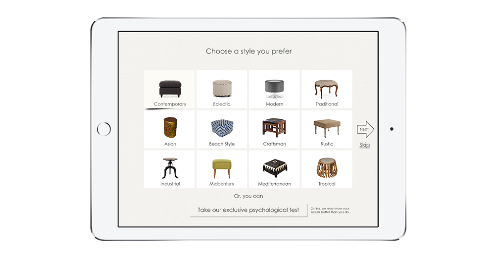
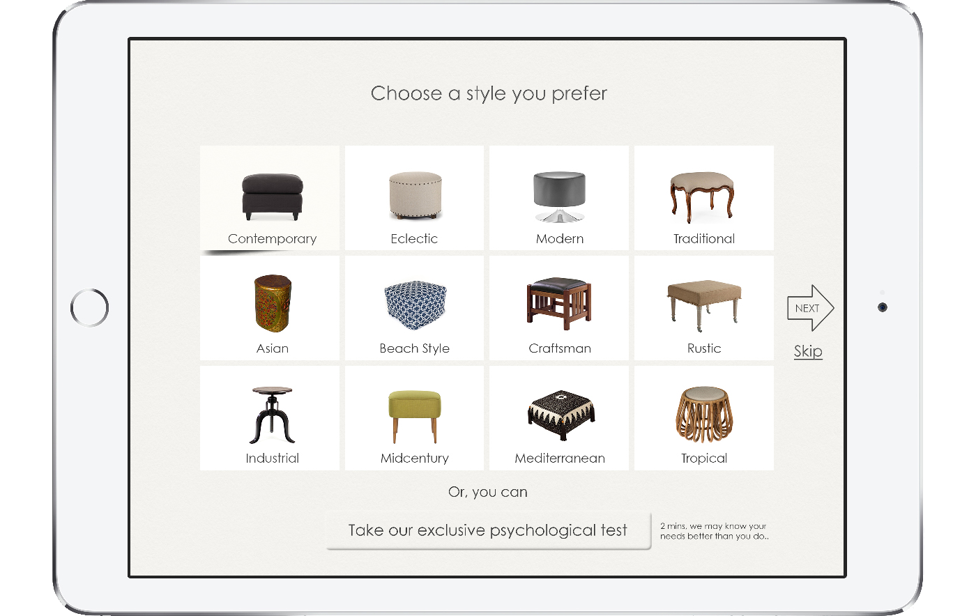
Unique psychological test to find user’s taste
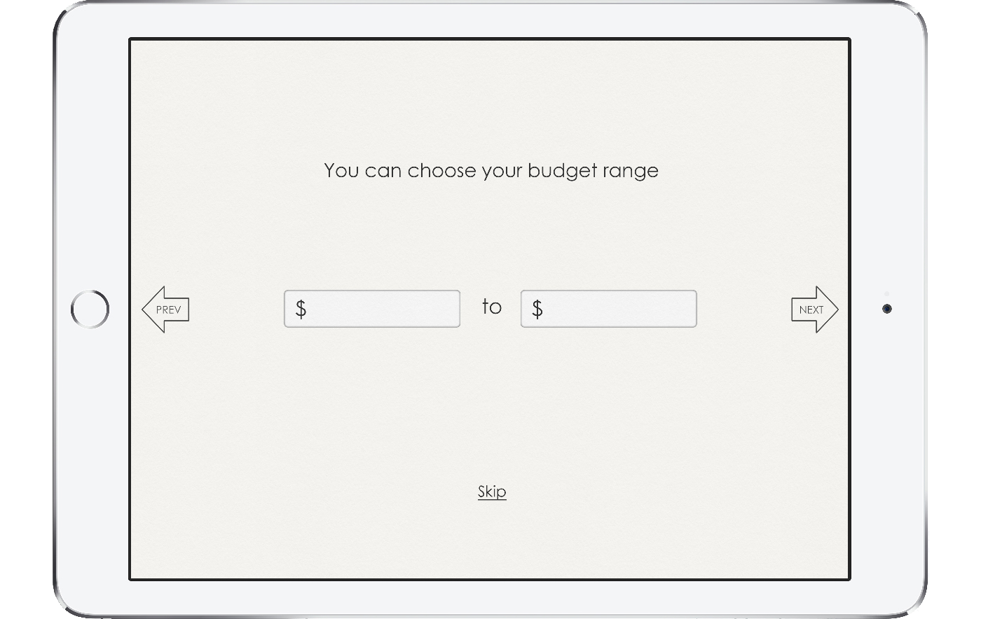
Predefine style, color and budget preference
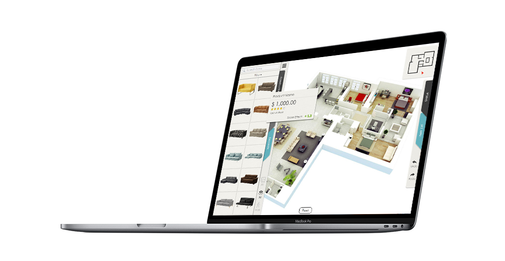
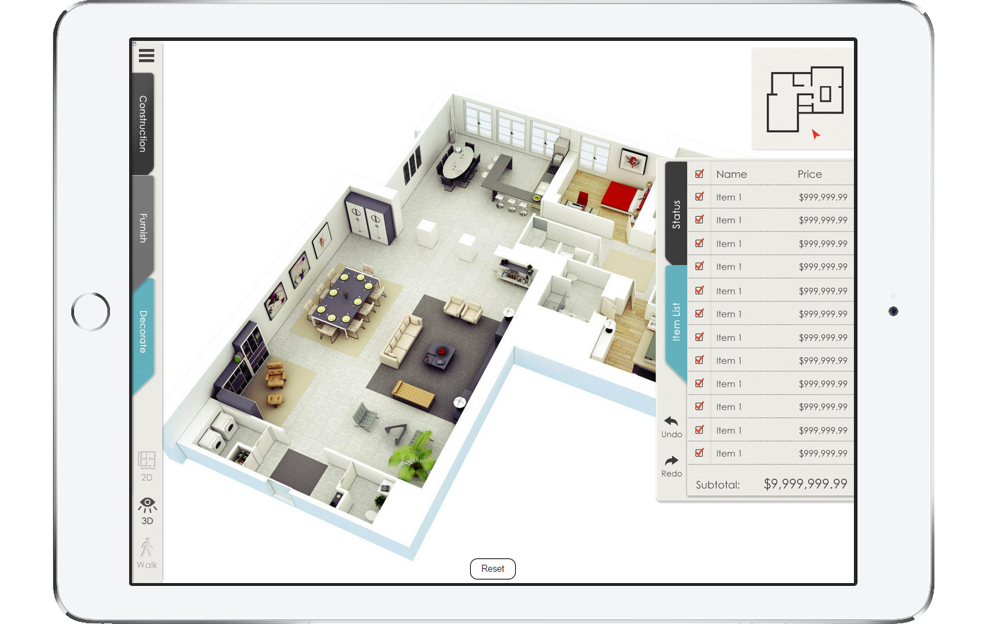
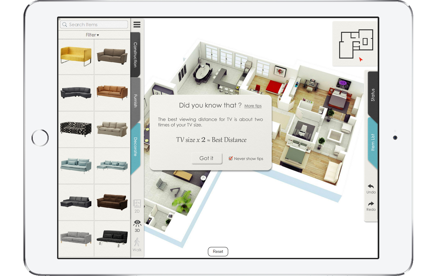
Item suggestion(base on user’s style, color and budge preference)
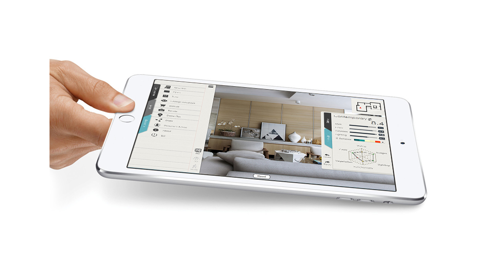
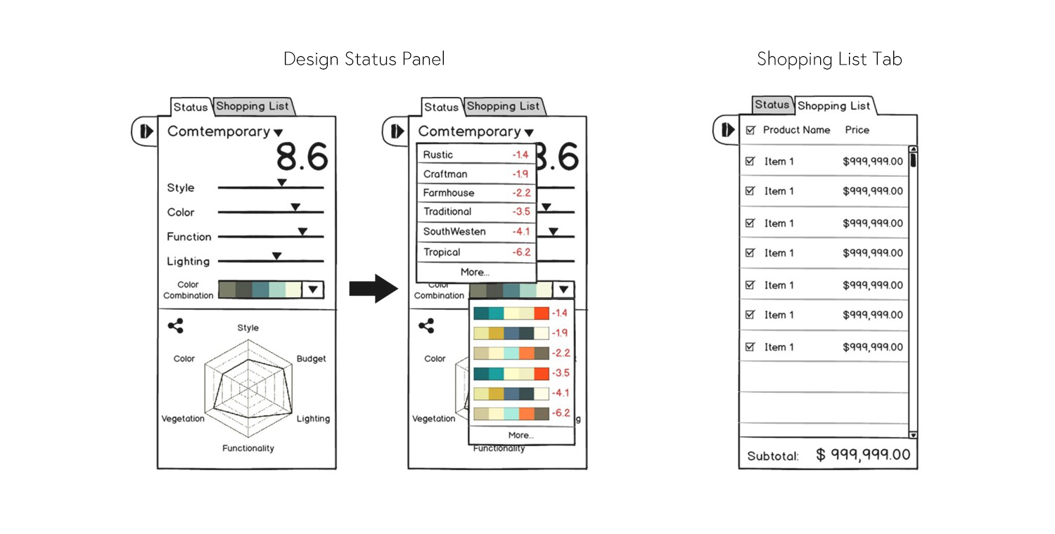
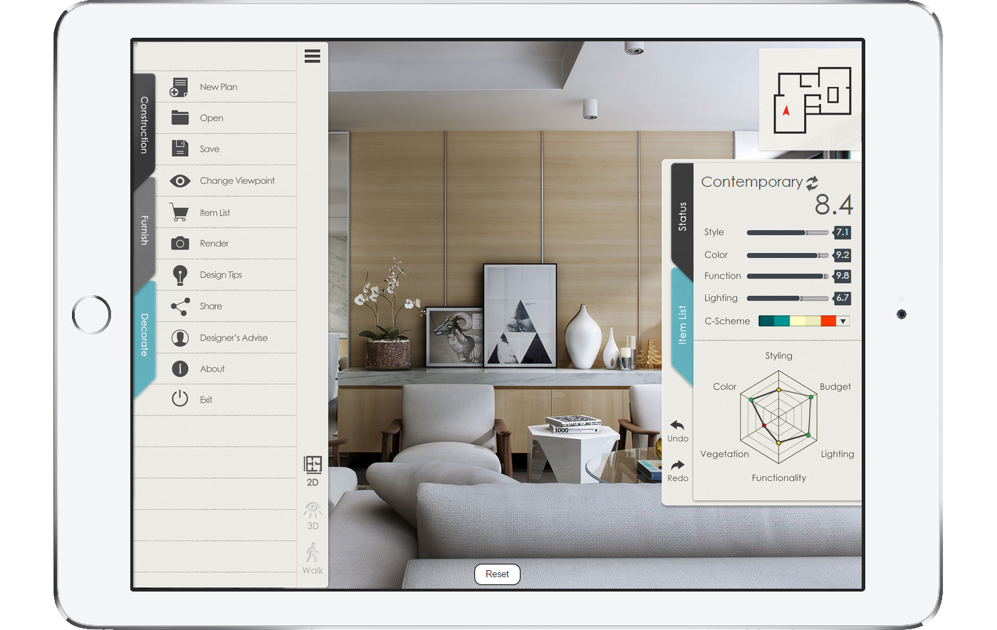
Multifaceted score system
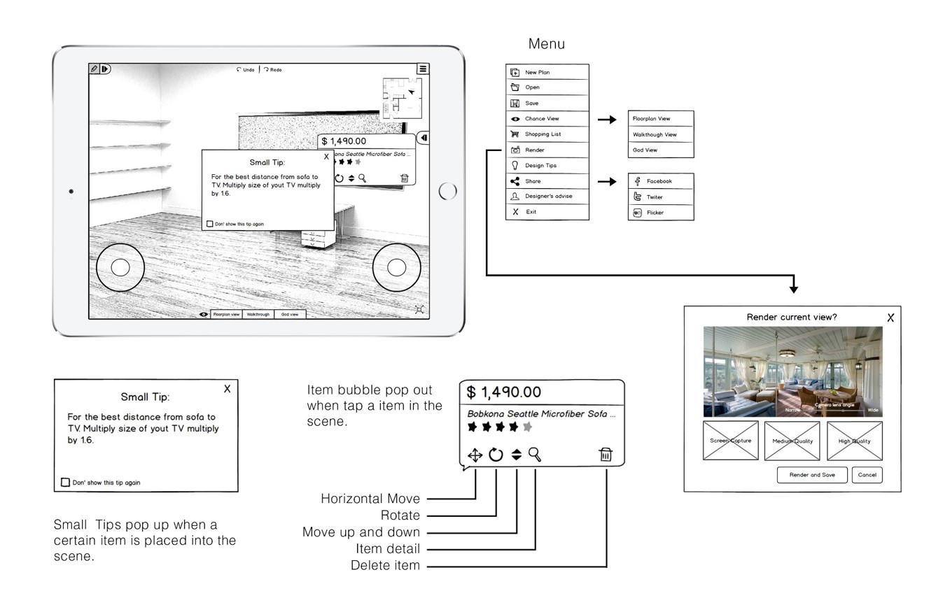
Friendly infographic design feedback
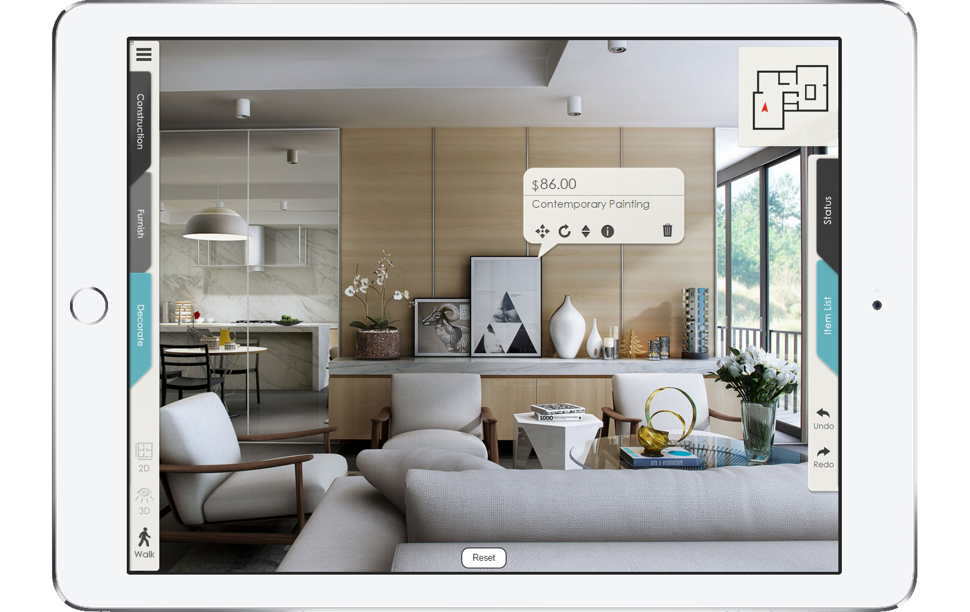
Practical design modifier
One stop service for interior design and staging
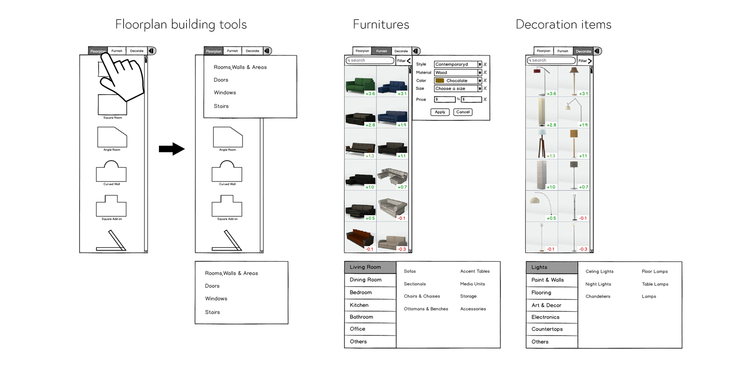
Clean, neat and practical interface
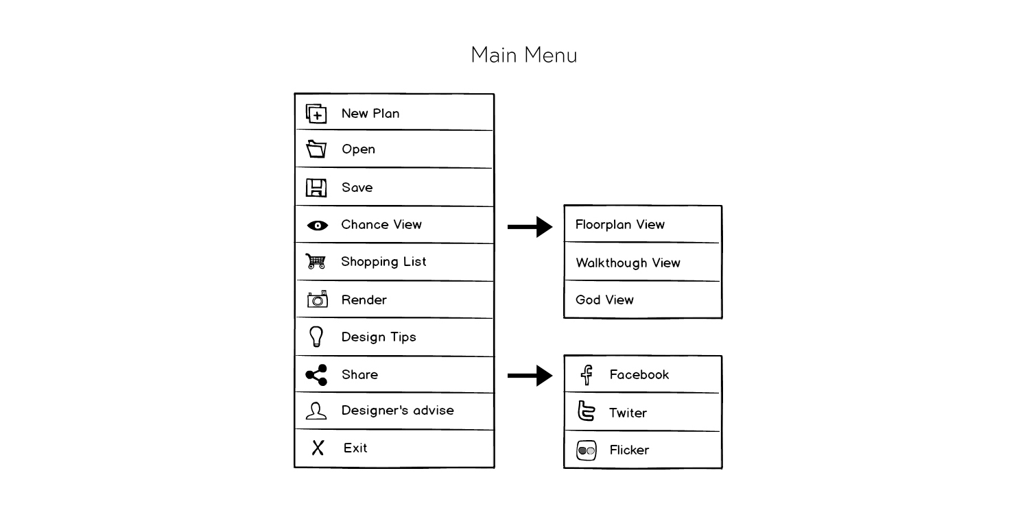
Simpler and efficient information architecture
Why you need it
Home, the warn nest of you and your family, you have experienced about half of your life in company with her, she definitely deserve our best care and treatment.
HomeSolution can help untrained people like you and me to design, staging their residence, not only decoration, also about life style.
Unlike other house design application, HomeSolution can really help user hand in hand to design their home by the smart AI design assist system.
The goal of HomeSolution is provide a one stop service for users, from a inspiration to finally get it achieve.

What make it different

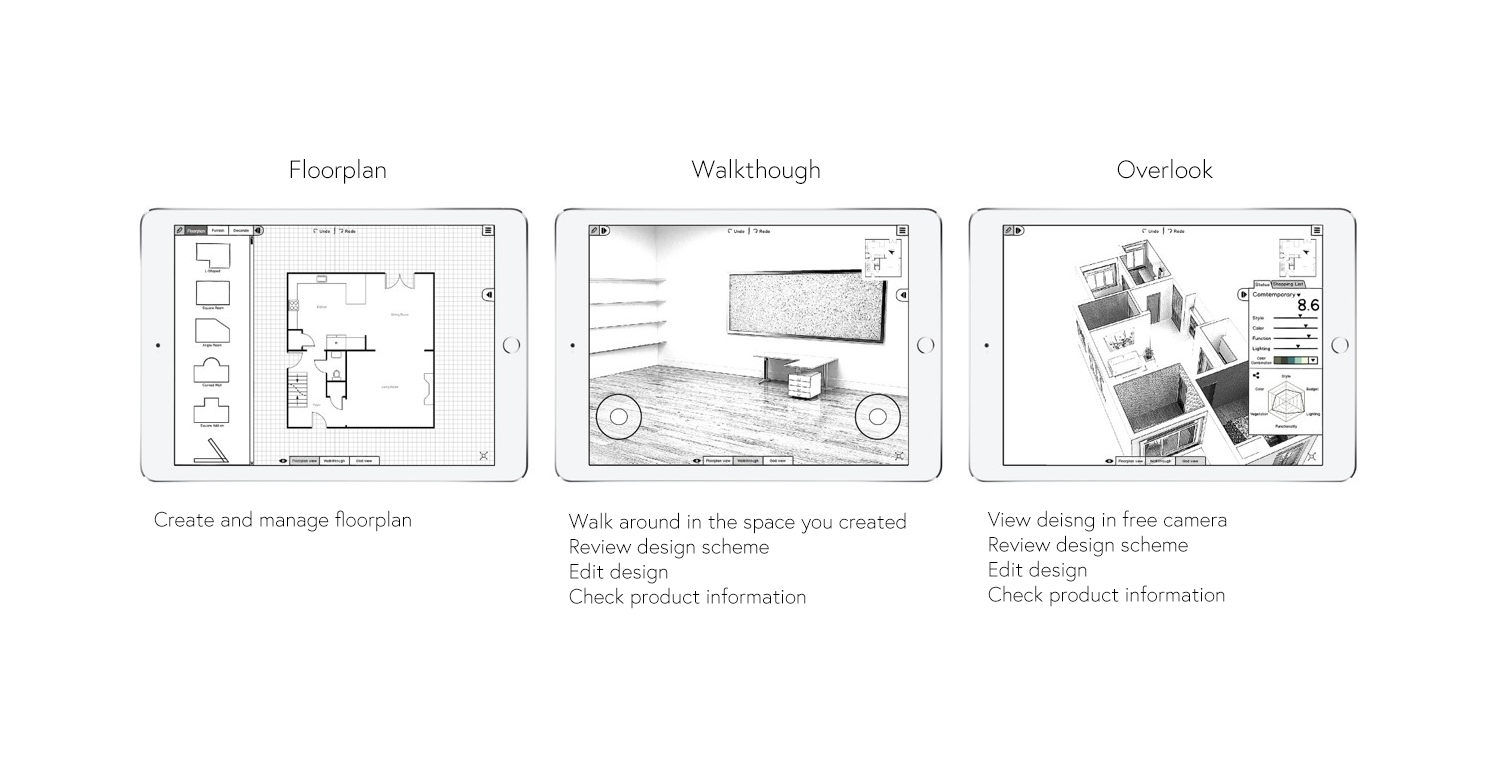
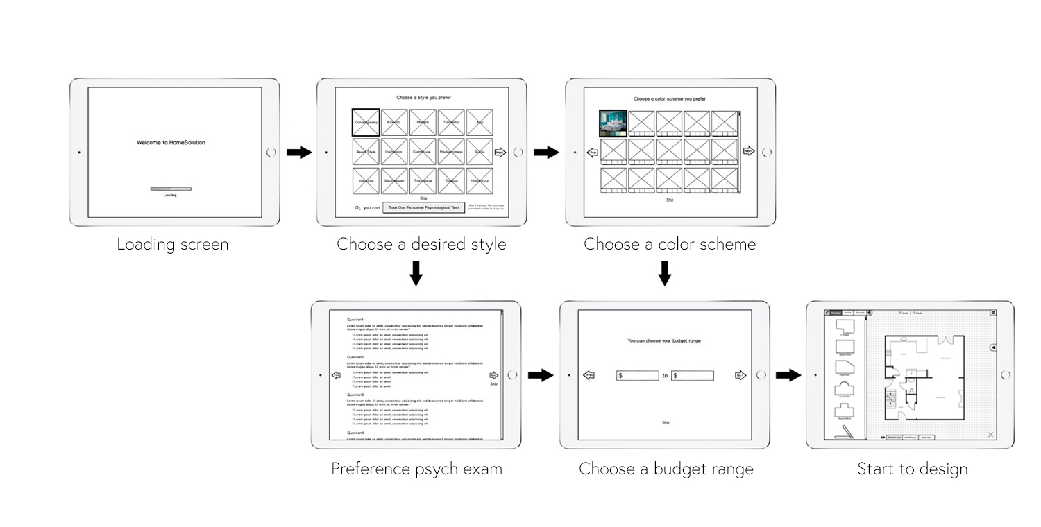
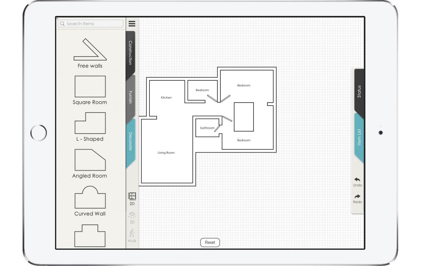
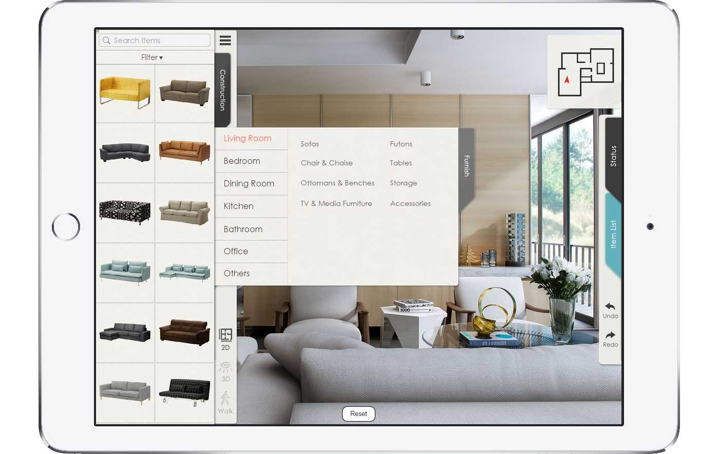
HomeSolution provide three different mode of editing and observation: 2D floor plan, 3D overlook and 3 Dwalk-through. Each mode has different point of view and functions. And user can preview the designing in walk-though mode like he/she is really standing and walking in the room.
Our smart AI design assist system start to help from the first second when user start o use it, it guess user's preference, give user suggestions and feedback and a overall sore of the design.
Working Process
ROLES: Product designer, UX designer, UI designer
TOOLS: Adobe Photoshop, Adobe Illustrator, Balsamiq Mockups, Axure RP,
Researching
There are already few interior/floorplan design application in the market. Generally the key feature of these applications is for customize and visualize user’s idea of their design plan. Each of them has their feature or advantages. I need to get familiar with this business before I get into, and keep update my knowledge and information.
According to my research, most of those similar products in the market have not so good productivity, and all of them are lack of design guide or feedback.

Ideation -Sketching
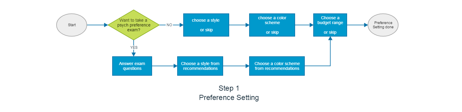
User Experience flow chart
Wireframing
Like other projects the wireframe of HomeSolution had gone through several generations. Every time a new idea came up will be a update.
Story Boarding
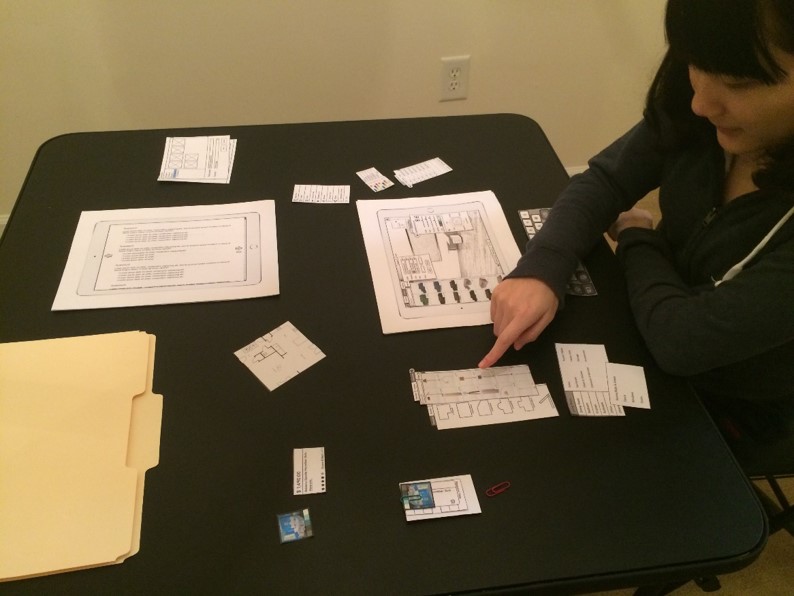
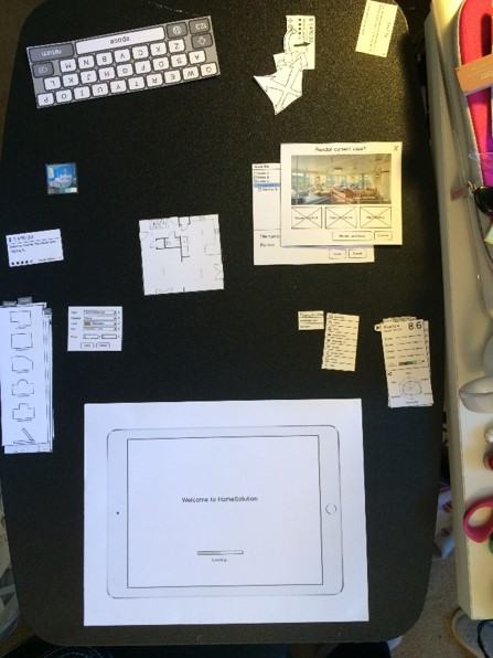
Paper Prototype
Paper prototype is made from wire-frame prints. After did some usability tests with my different tester, few updates was made to the wire-frame. Mostly reorganize buttons and stuff.
Hi-Fi Interface
High fidelity interface is made by Adobe Photoshop. Home-solution is a design based application, I want it looks neat and elegant. On the other hand this app is a powerful tool, it has its complexity in some way. I prefer minimalist design to keep everything as simple as possible in visual aspect. In the mean time, interface need to be intuitive to help user understand the app.
Firstly I tried flat design style, It's trendy, functionally flexible and looks neat. But then I realize the issue: The left side system menu is consolidated with prop(furniture, etc.) categories navigation. There are too many stuffs, lots of buttons are sticked together, it looks "no-clue" to me, I have to find another way to deal with it.
I came up to use the "old school" skeuomorphic design which has been abandon from mainstream for about a year. The advantage of using skeuomorphic design is it looks more "friendly" and it's more intuitive, I can utilize these advantage to help me solve the issue, as long as I can keep it elegant.

I used visual concept from note book, folder index, ink and embossing for visual embellishment. Interface background is present as texture of high quality cotton papers. Navigation is basically multiple layer of paper, user move these paper in and out to see different content. The only disadvantage of this design is it took the whole column on the left side of screen to build the index system, but it make the structure super clear and self-explaining. As platform of Apple iPad which has much bigger screen than cellphone, I believe it's definatly worth it.
To change the visual style to use skeuomorphic design cause the most dramatic change of wire-frame since beginning. I re-structure the navigation in a layered system, and re-design the interacting logic. After few iteration, I feel everything is making sense and united.
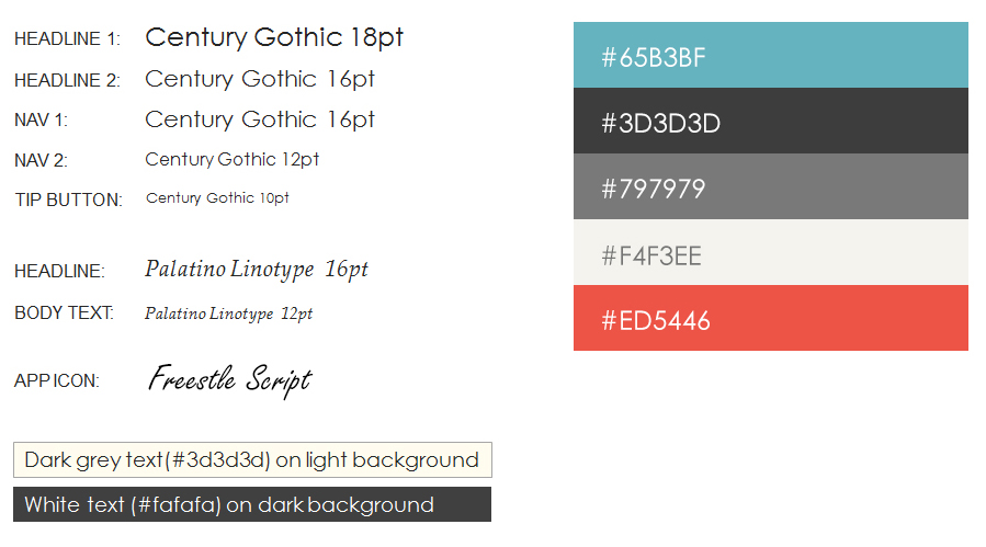
Typography
Most commonly used typeface is Century Gothic, this font is light, neat and elegant as I see, perfectly fit application’s theme. It’s been used for menu and system text.
Secondary font is Italic Palatino Linotype, Palatino is based on the letters formed by a broad nib pen. It’s been used for Tips and recommendation, it’ll give the feeling of customized and authoritative.
The Font on app icon is Freestyle Script, the reason of not to us Century Gothic is, I want the first impression of the application be more “friendly” and easy to get close. I already put a minimalism furniture as background image, I need something to soften and light it up.

To keep consitance with interface design language, iOS app icon(button) is constructed by three elements: paper texture background, a minimalist furniture (ottoman) icon and the initial letter of HomeSolution "HS" in hand writing style.