

TM Finance
TM Finance is a integrated finance application on iOS tablet platform. It provides financial news, data and commentary regarding stock, press releases, financial reports. It utilizes big screen of tablet to maximize productivity and user experience.
The purpose of this project is making a high fidelity interactive prototype, There are two main functions I focused on: financial news and stock quote.
Feature
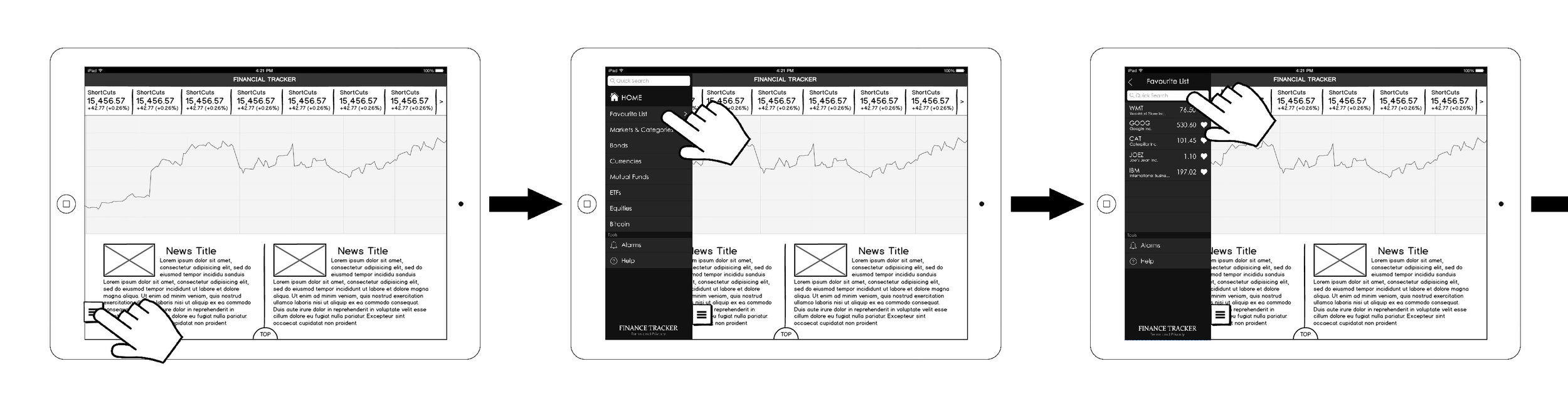
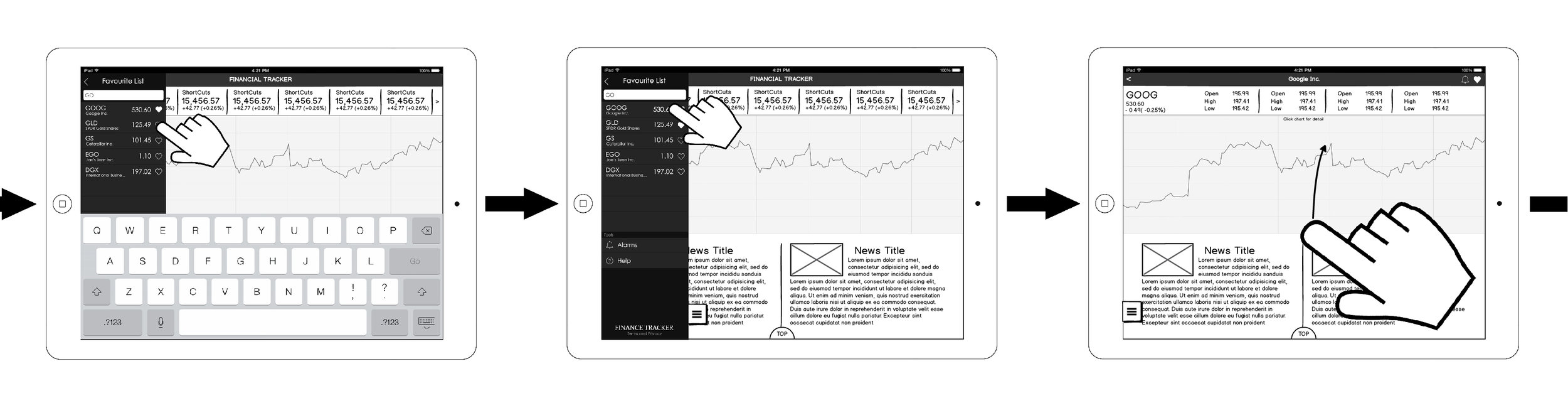
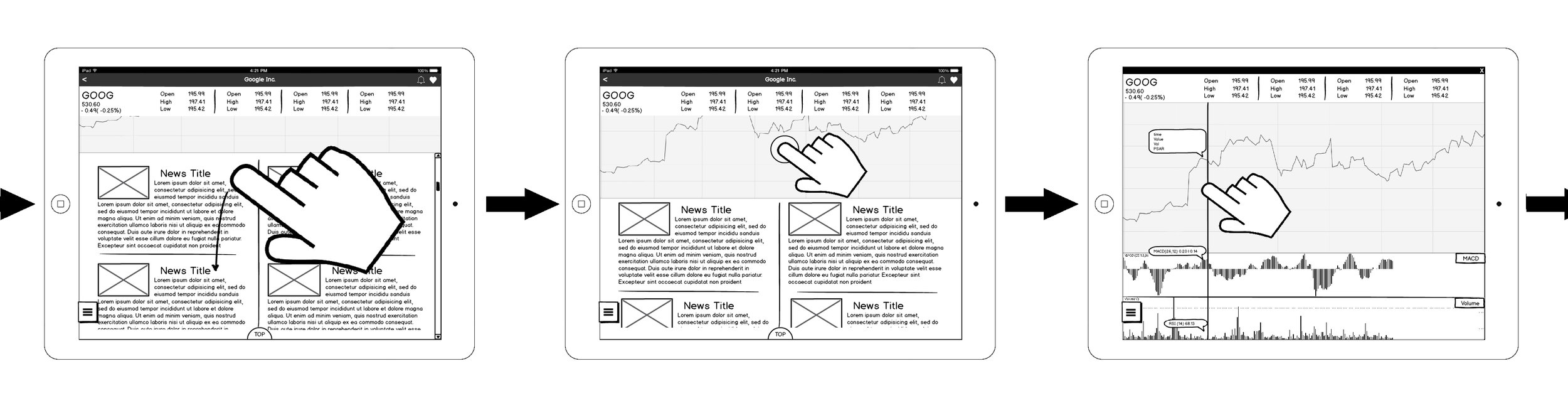
- Quick access side menu for your favorite stocks, equities
- Top sticked equities on index page keep them always on track
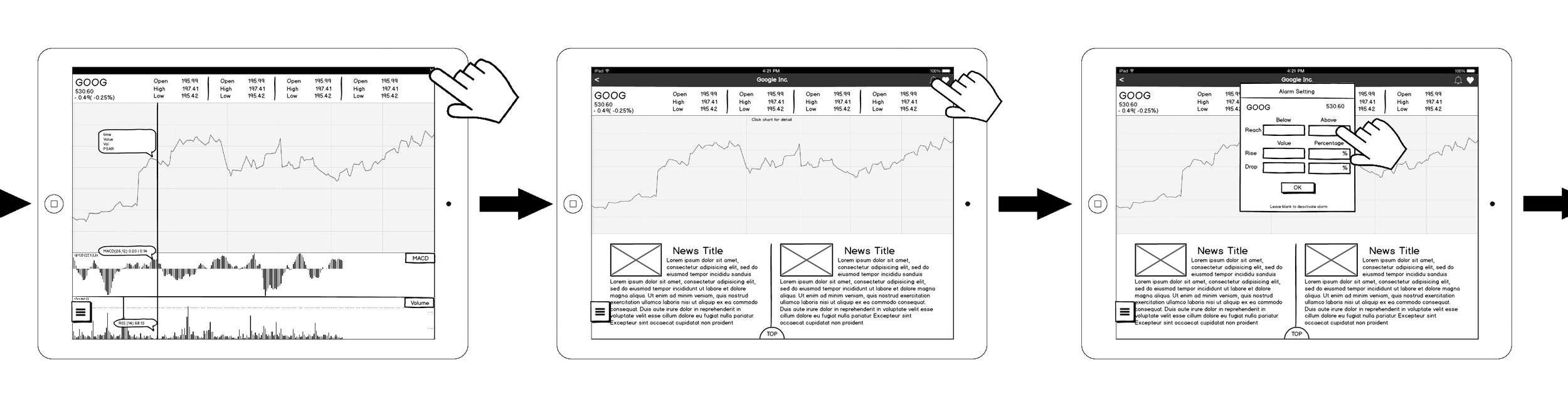
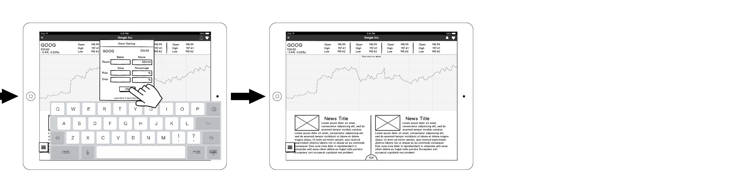
- Alarm to notice user about their stock in critical circumstance
- Customizable charts for equities
Working Process
ROLES: Product Designer, UX designer, UI designer
TOOLS: Balsamiq Mockups, Adobe Photoshop, Axure
Ideation
This purpose of this project is to make a user friendly, highly productivity financial information service and analyze application. That include financial news, equity market and custom market alarm system and most importantly wide variety of data analyzing tools.
There are some similar products on the market are very good at some respect, some are feed news, some are good at real time data accuracy, some have very functional trading feature. But I found most of them are lacking of variety of data analyzing method.
With experience of some stock trading/analyze tool back in my home country China, I think it's not bad to have more data analyzing tools for user to play with.
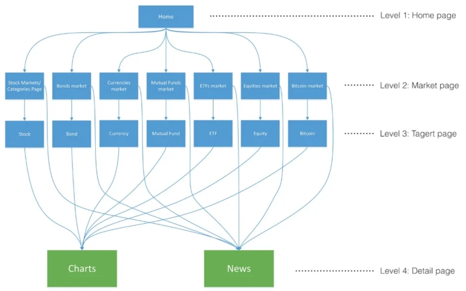
Structuring
I start with basic structure of the interface, I construct from top to bottom of four layers:
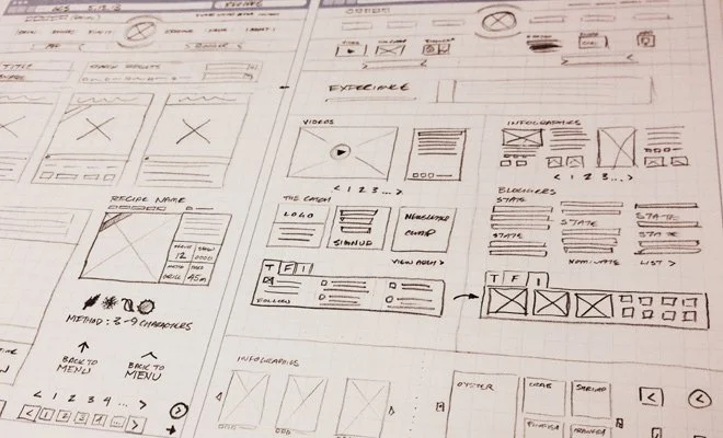
Wireframing
I've sketch out some general layout idea of each layers of interface on paper and keep adding detail.
Narrative Storyboarding
When most of interface is sketched out, I made them up in Balsamiq Mockup to finalize the idea. and sequence them in order to make a narrative storyboard.
Paper Prototype
I made a rough prototype by paper and sticky note. I used it to did a simple usability test, to make sure the interface is usable, and user can easily find whatever they want to check.

Interface
For the interface and visual design for this app, I want it to be super clean and low profile.
Interface is designed using Adobe Illustrator and Photoshop. All the interface I created are following a visual rhythm concept, which is kind extension of iOS design guide.
Top notification bar is always 44 pixel high, app home page banner is double of that. Highlighted stock bar are double of banner's height 176 pixel.
The main stock chart of the day is one of the most important thing on the home page.
X axis is time line, both the New York Stock Exchange and the Nasdaq National Market operate regularly from 9:30 a.m. to 4:00 p.m. ET, that's 6.5 trading hours, so the horizontal length has been separated in 13 half hours mark. Y axis indicate stock value change by percentage, divided in 7 section, each section is 88 pixel height.
